The brief
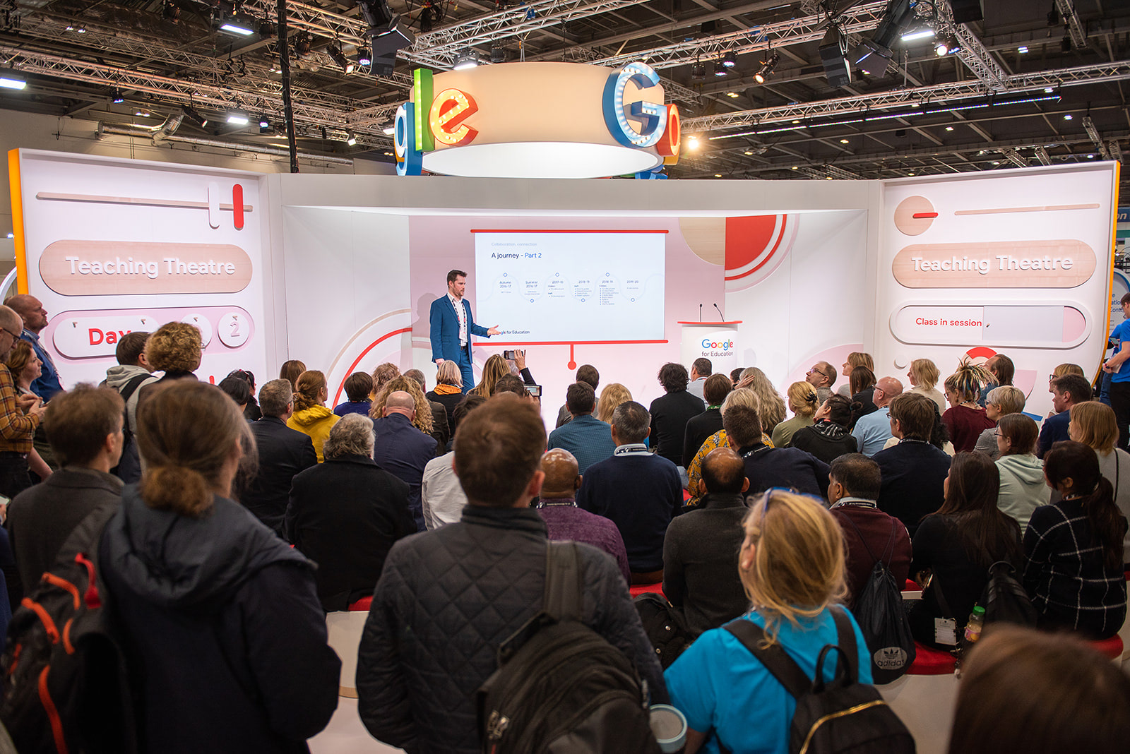
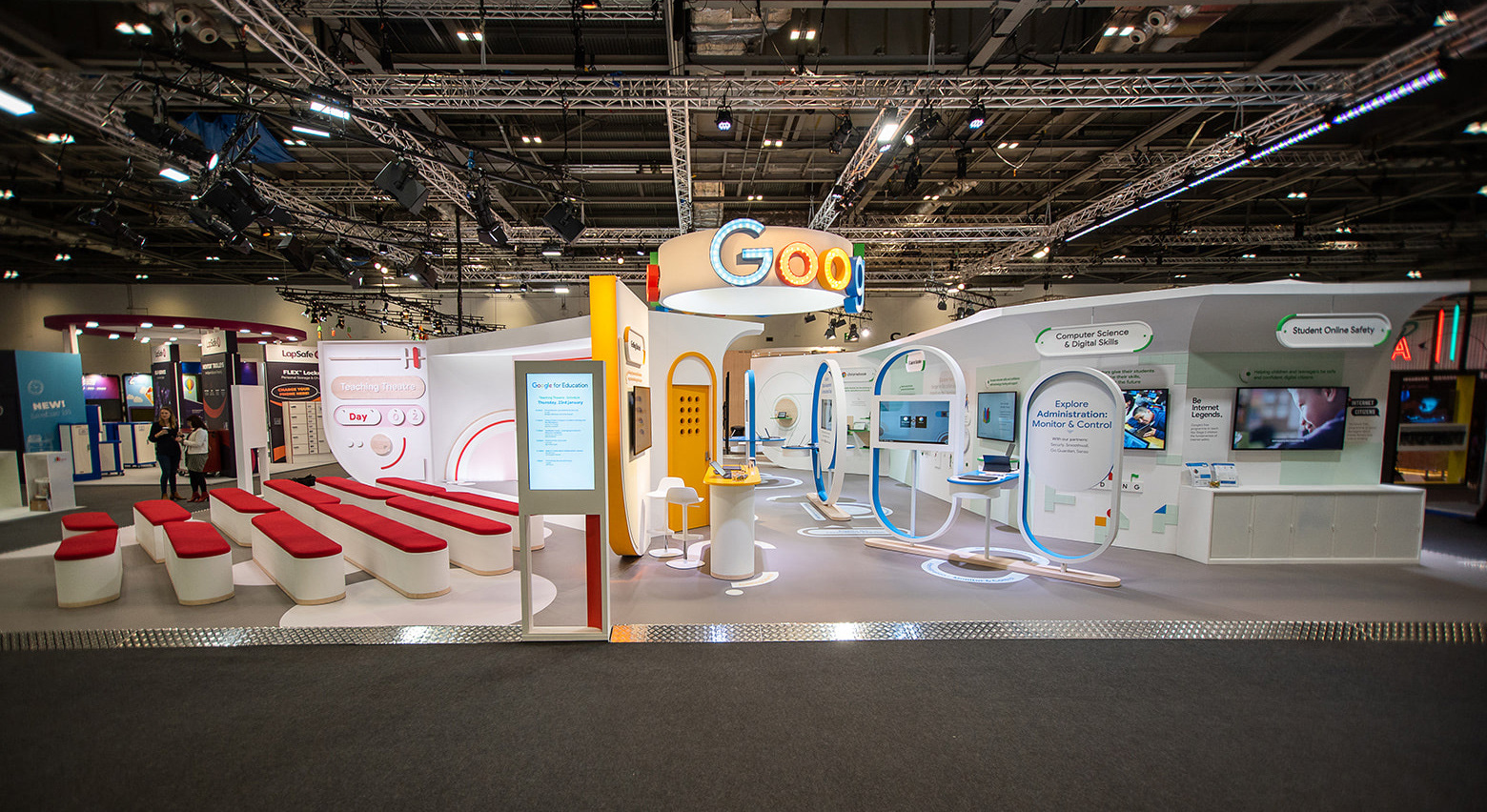
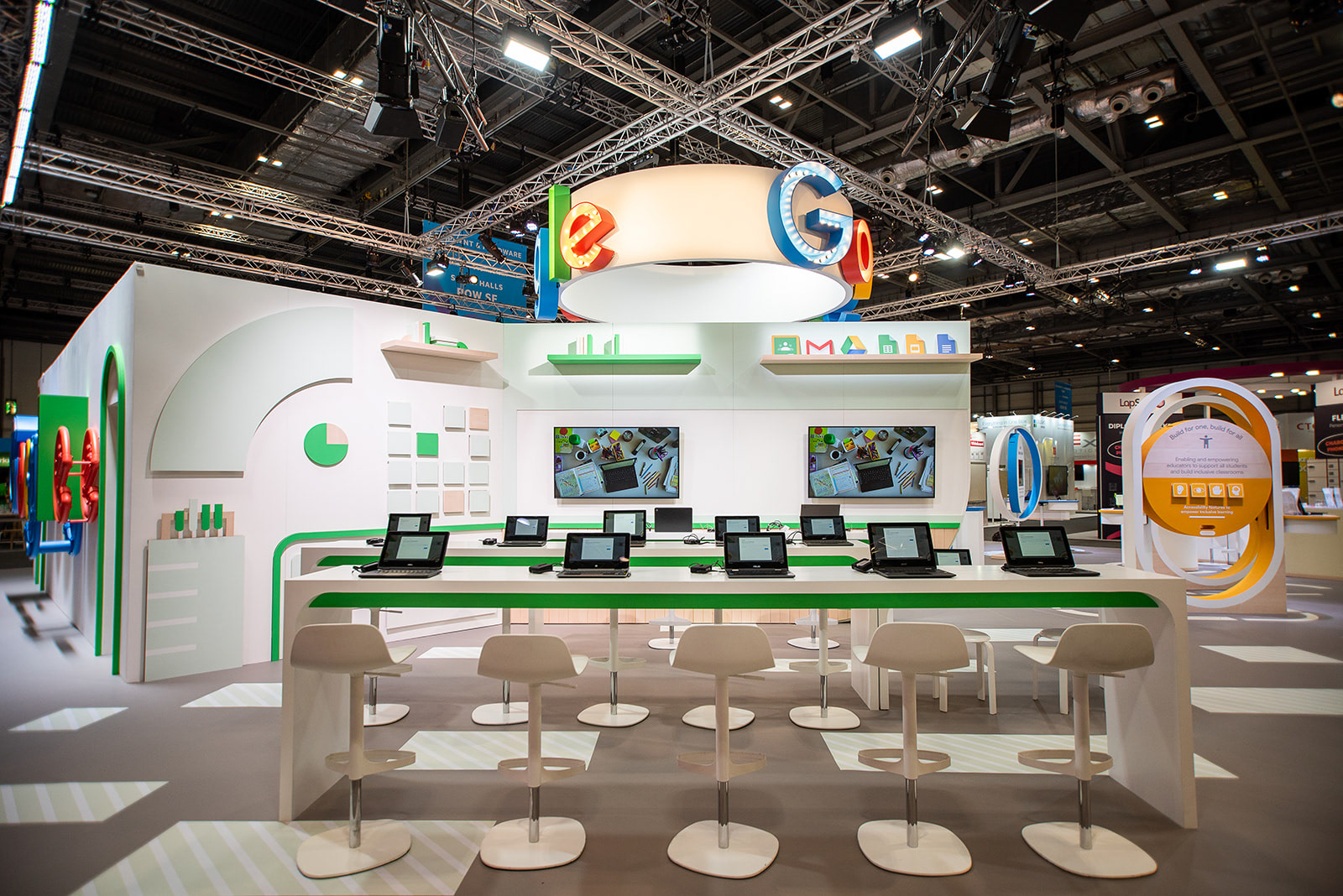
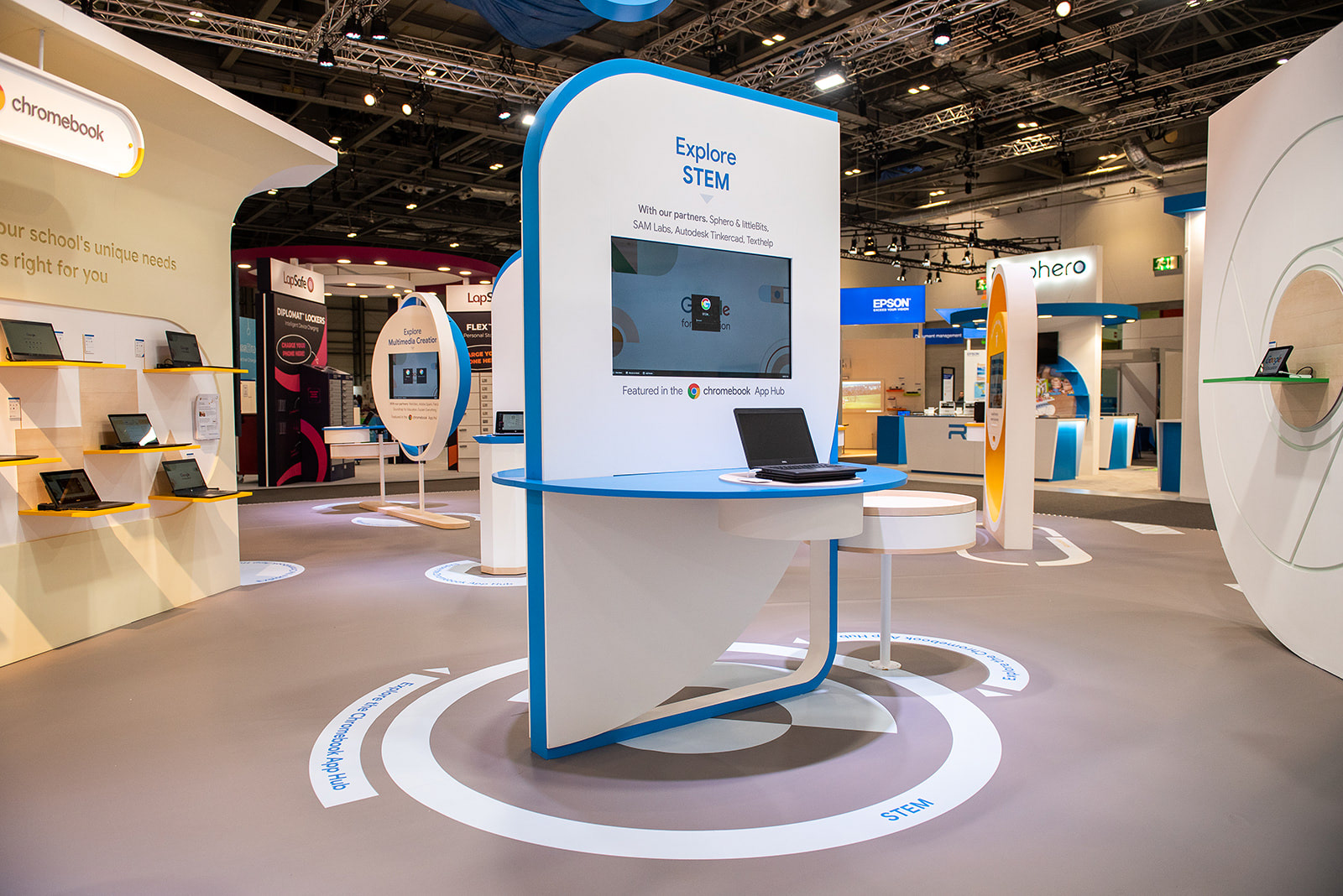
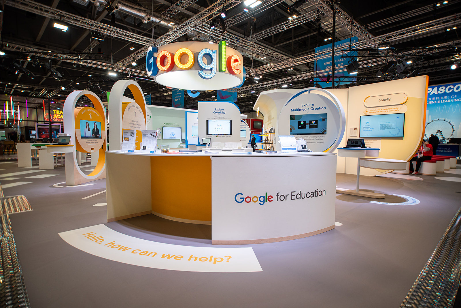
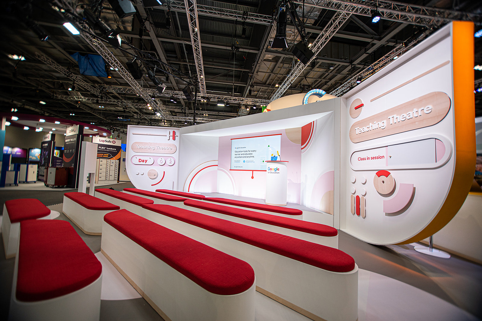
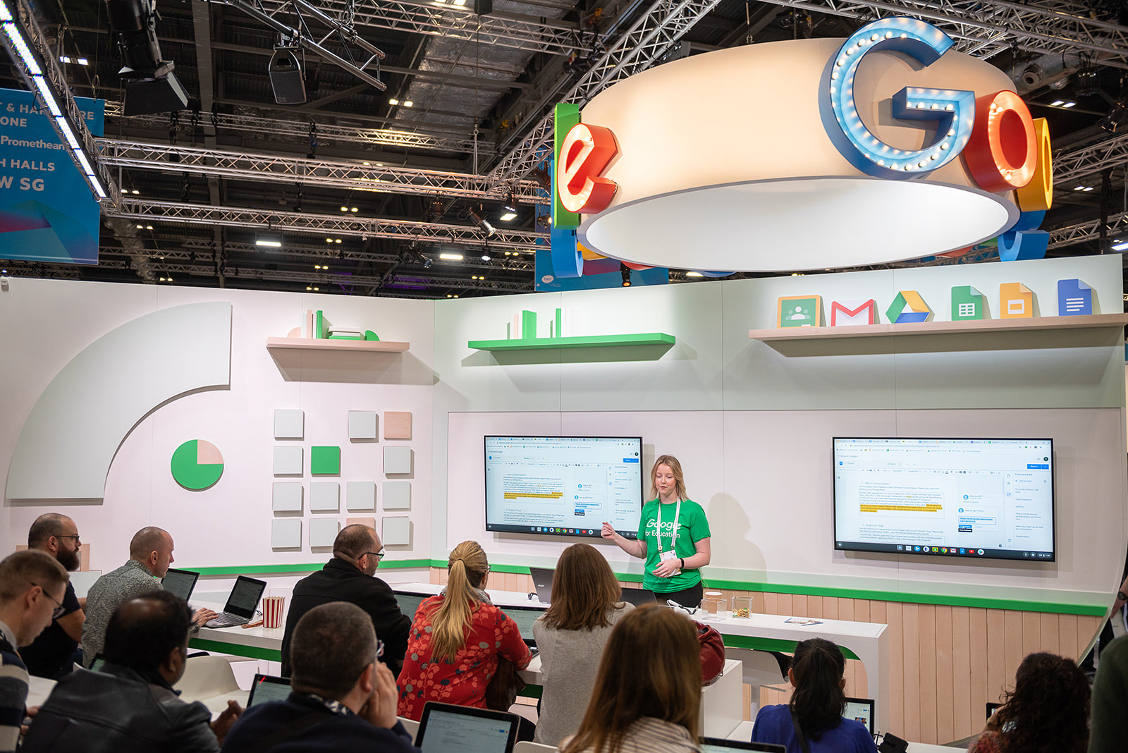
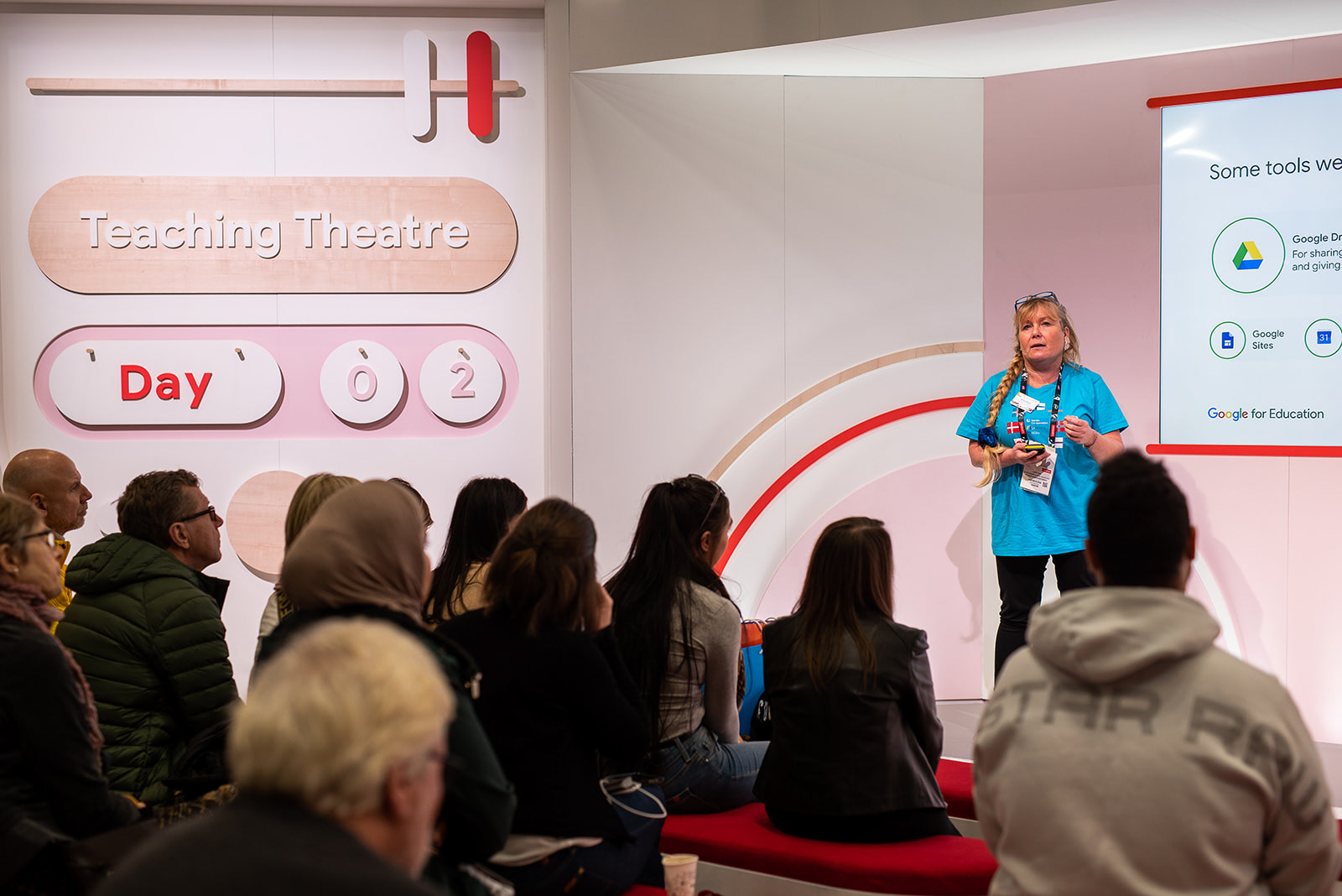
As well as the anticipated Googler-guided tech demo areas, classroom workshops and teaching theatre; this year Google for Education (EMEA) wanted the stand design to showcase products and services through hands-on, self-guided and engaging interactions for visitors (teachers, IT staff & students).
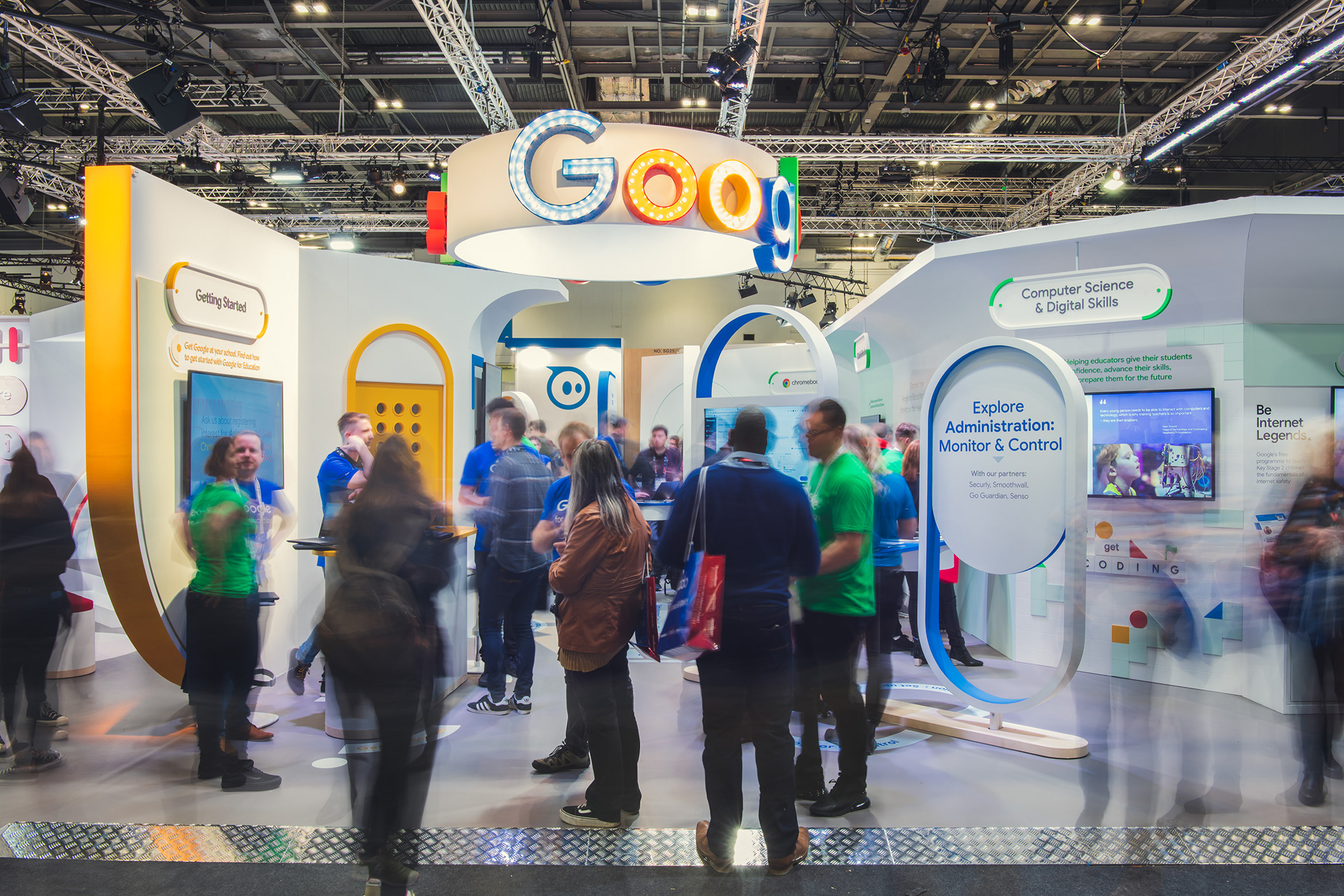
a mature Brand presence
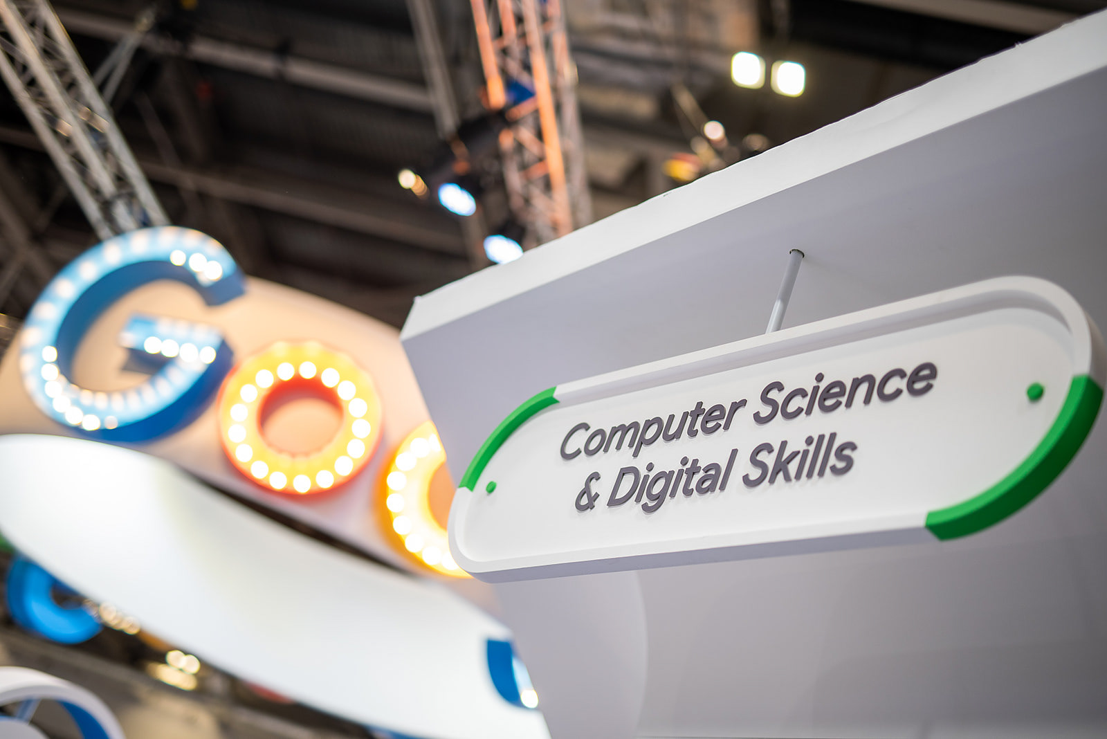
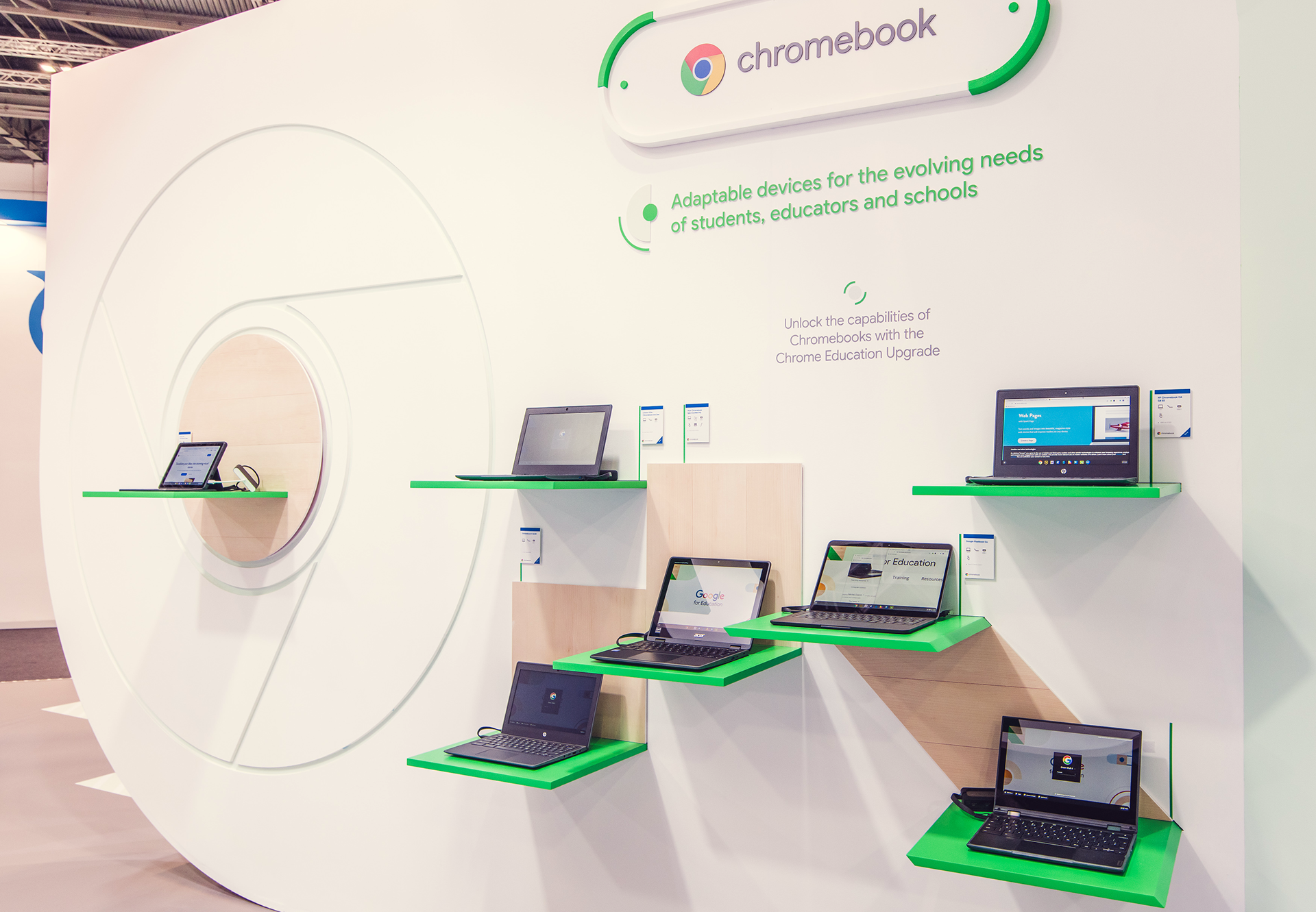
In keeping with the evolving Google brand style; the stand was kept clean, bright and light with apertures in the structures and colour highlights in their distinctive bold colour palette. The introduction of secondary colour tones across the walls & floor treatments helped to bring warmth and depth to this year's aesthetic.
Working In Sync
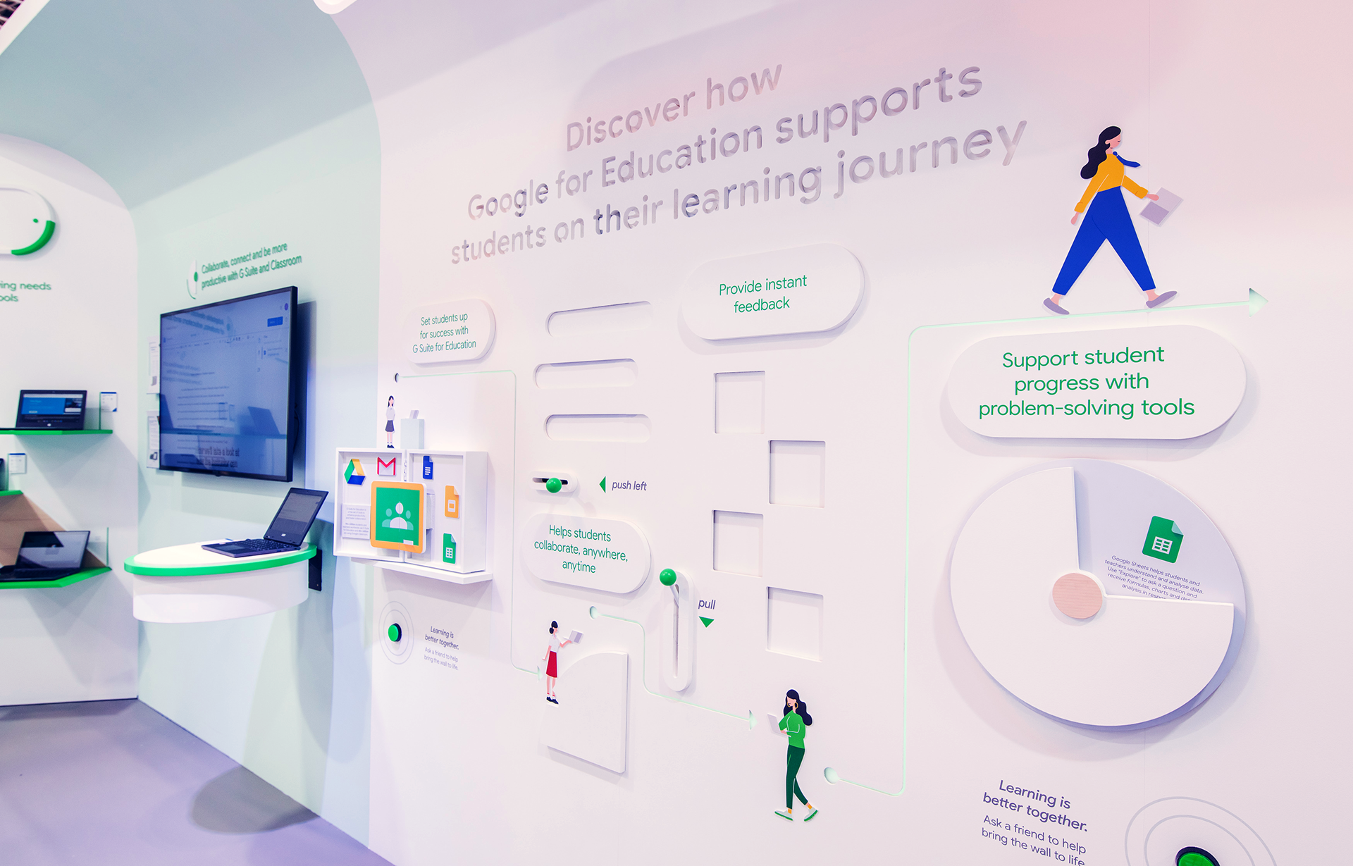
The graphic language of the space uses simple geometry and apertures to create a sense of moving parts that work together in-sync; to reflect the collaborative nature of chromebooks, the app hub and G suite products. The colour zoning to surfaces helped to guide visitors around the space and the abstracted forms were interpreted into an icon system and floor navigation that highlighted key product features & selling points.
HUman touch
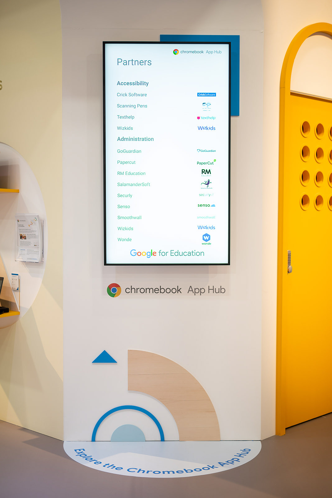
The graphic decoration was designed with physicality and getting hands-on in mind: etching the typography and pattern into walls & signage and extracting the shapes with layered wood. Behind the welcome desk, a 3D printed replica of the stand and printed maps were provided for self-navigation. Colours and materiality were echoed in the branding on printed material and digital screens.

Interactive & Engaging
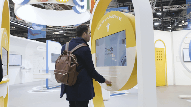
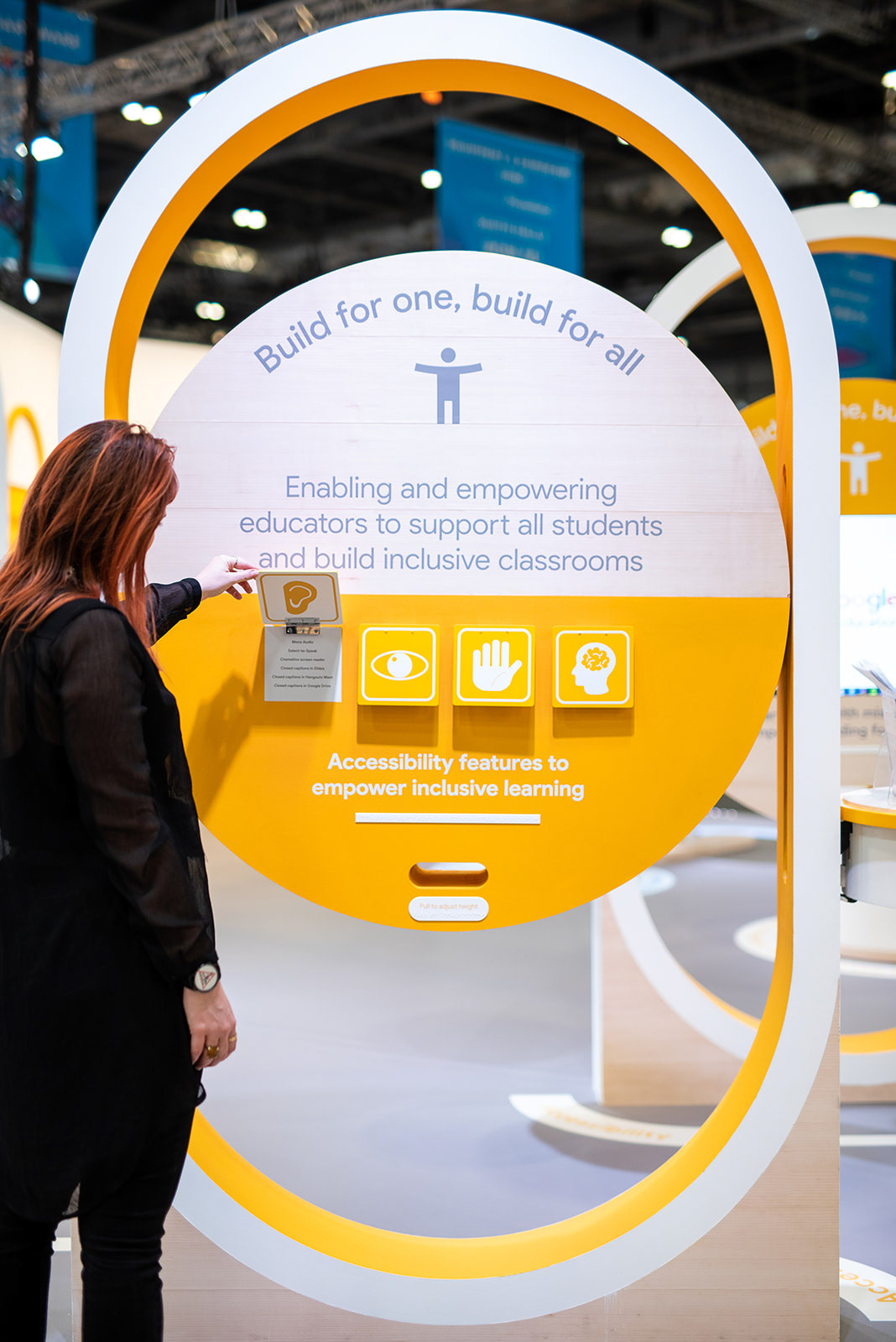
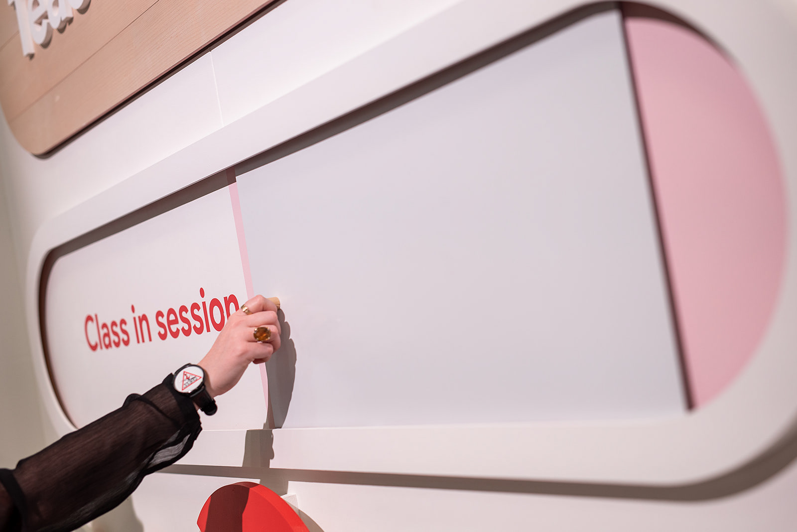
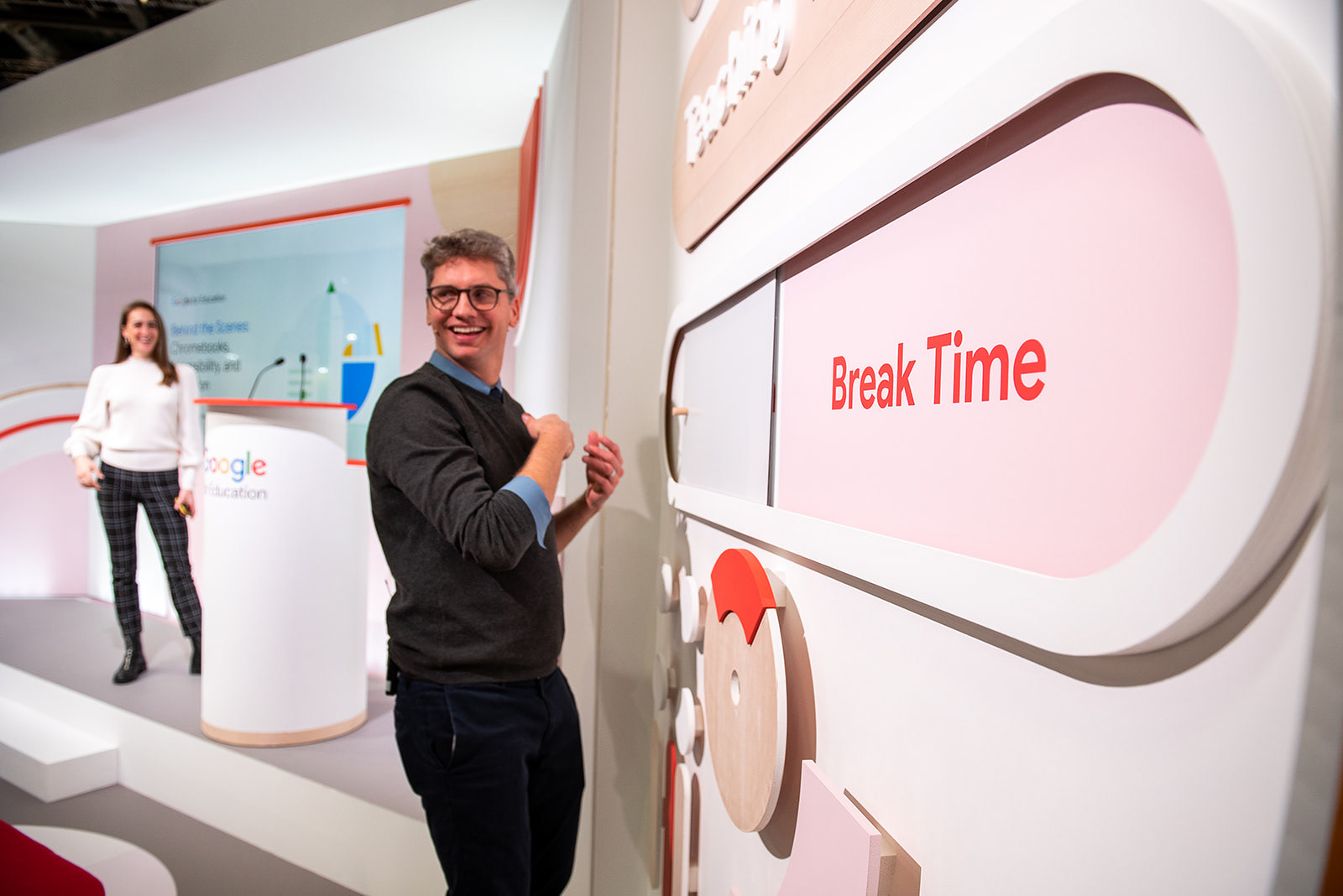
Playful interactions were integrated into the stand to engage visitors with the simplicity of using google products and designed for the visitor to easily access product information. The Accessibility features structures could be adjusted for different heights, as well as pull-up flaps for information and braille for key messaging. Decoration to the teaching theatre wings were given functionality by doubling as interchangeable signage.
Moments of Discovery
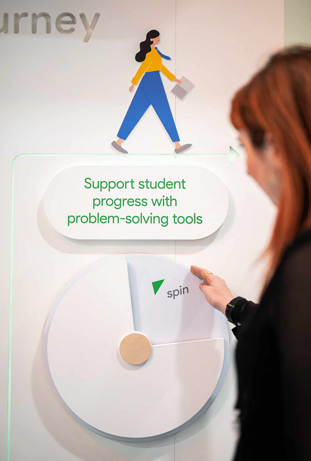
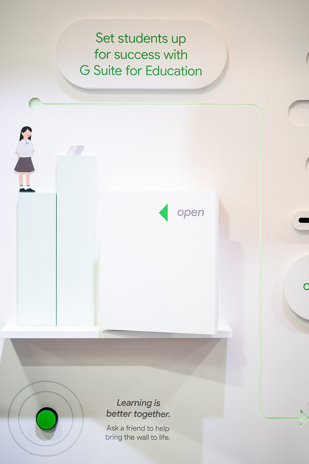
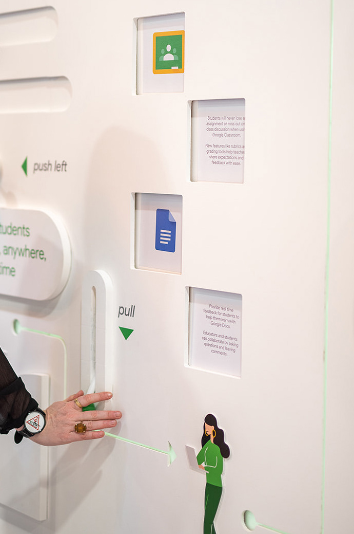
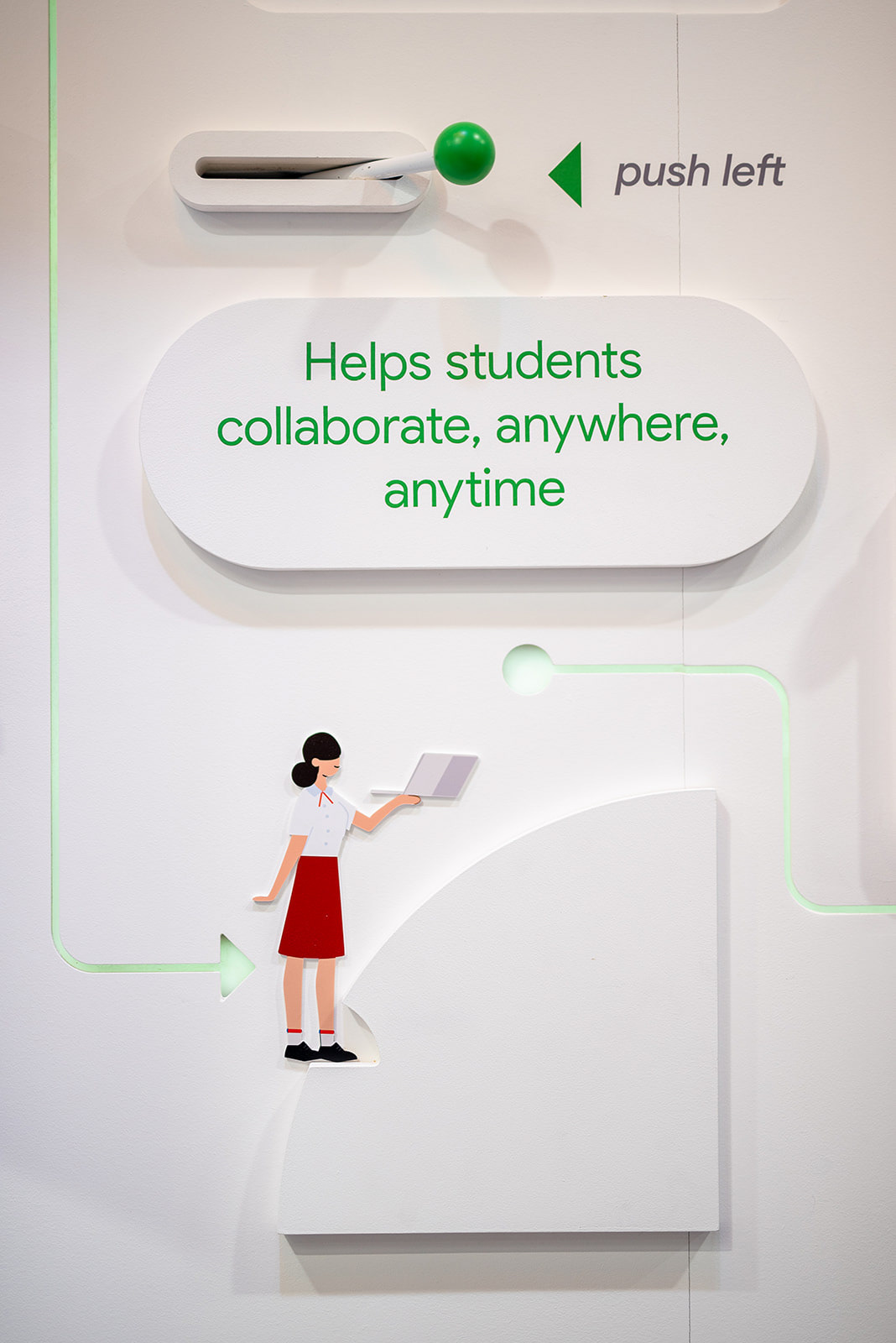
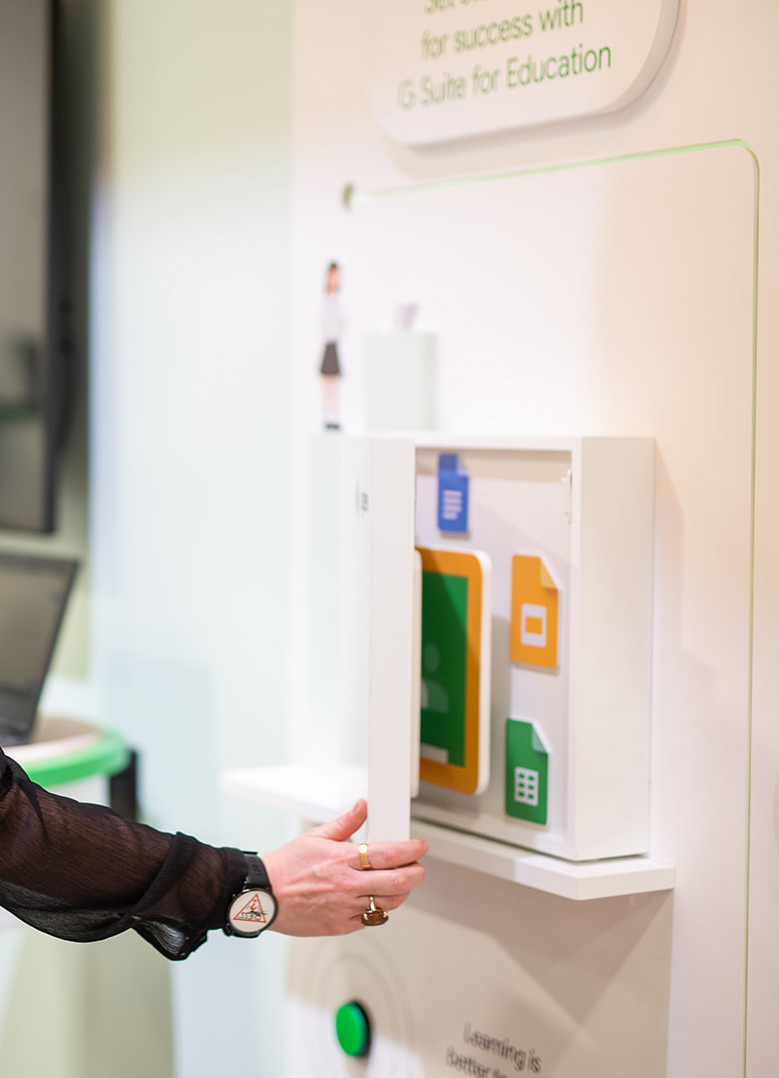
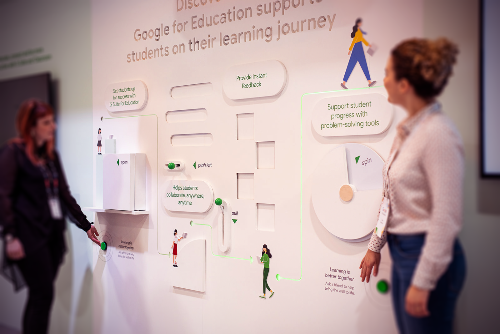
This interactive feature wall was designed to showcase the supportive nature of G Suite, helping students and teachers to collaborate in real-time. Each key message was given a simple movement to reveal more information: opening books, pulling levers and spinning discs.
Working together
To highlight the message of 'learning is better together', two push buttons were placed far apart at each end of the wall, encouraging visitors to work together to activate a hidden light sequence - lighting up the student journey arrow and spelling out 'together' from letters within the etched heading.
EXIT VIA THE GIFT SHOP
The stand received great feedback from the client and was on featured on the BETT show website highlights every day, securing the job for BETT 2021 (at the time) and keeping the Google stand a destination every year.